John Roemer on his Billboard Installation in Baker-Miller Pink


Black Cube interviews John Roemer on his triptych billboard installation in downtown Denver and the significance of the color called Baker-Miller Pink.
John Roemer on his Billboard Installation in Baker-Miller Pink
Black Cube: Tell us about your installation Baker-Miller-Pink.
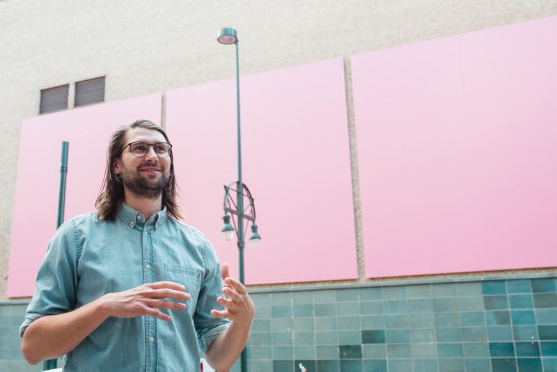
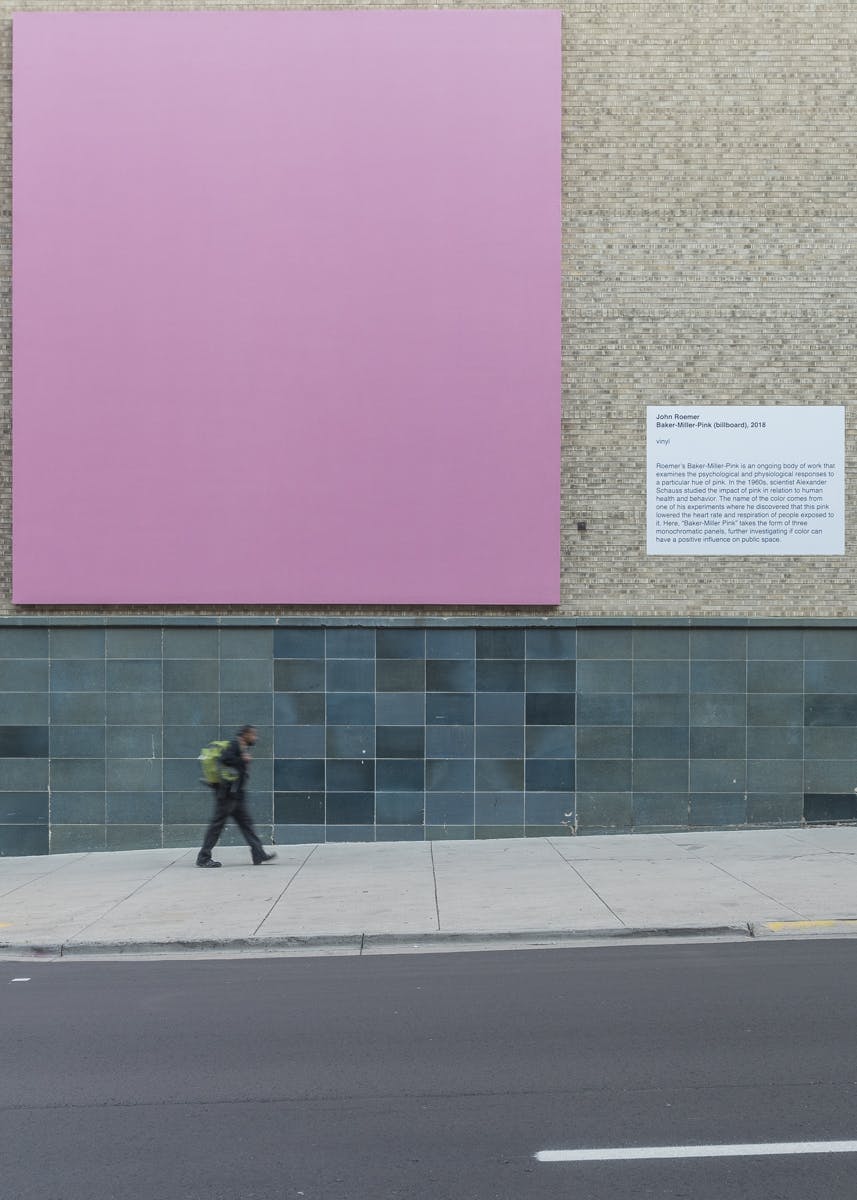
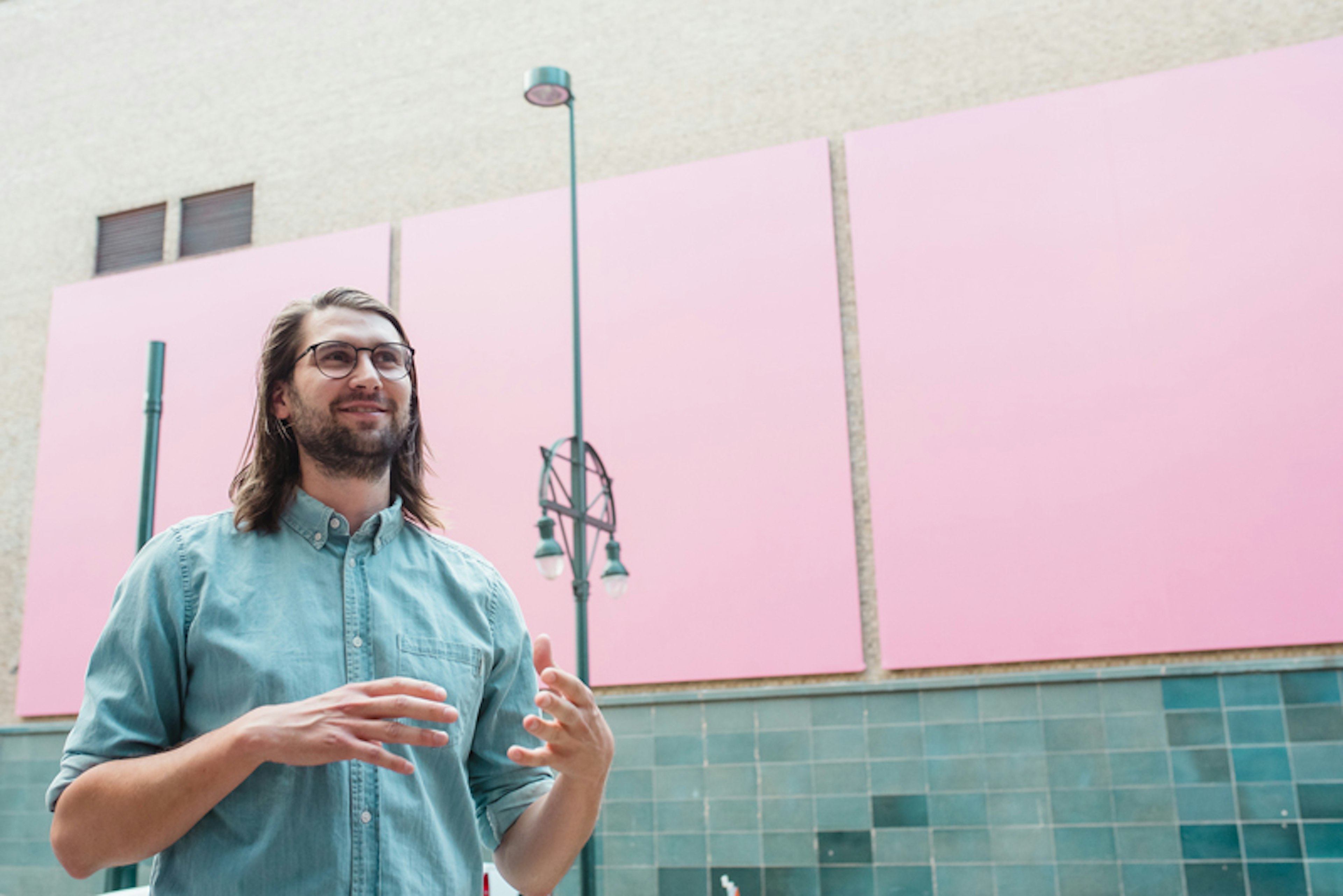
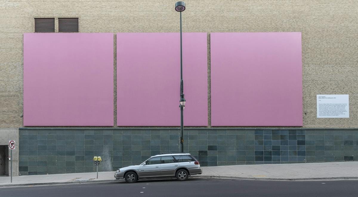
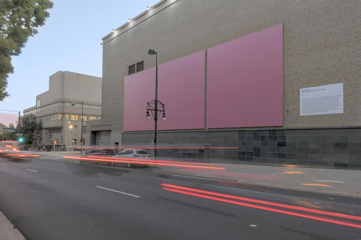
John Roemer: The installation is three nearly-square billboards in a row. Each one is the same color – Baker-Miller Pink. The goal is to present this color in a public space for viewers to spend a moment with it then take the knowledge of the color's effects on them.
BC: What is the significance of this particular shade of pink?
JR: Baker-Miller Pink is a specific shade of pink named after two naval officers who, after hearing about the research of Dr. Alexander Schauss, painted confinement cells in their naval correctional facility the color. They confirmed Schauss' findings that people who were exposed to the color exhibited less aggravated and violent behaviors. Schauss theorized that the color lowered the heart rate and respiratory rate of people exposed to it.
I'd strongly recommend this essay by David Byrne about Pink in general: http://cabinetmagazine.org/issues/11/pink.php

BC: How do you hope this artwork will impact passersby?
JR: Although the effects of Baker-Miller Pink have been disputed, I still feel like the gesture of presenting it to other people is positive on its own. I want to provide a moment of presence and reflection for viewers. The intervention is posing a question, If this color can have a measurable physical and mental effect, what effects does the onslaught of visual ephemera one encounters each day have
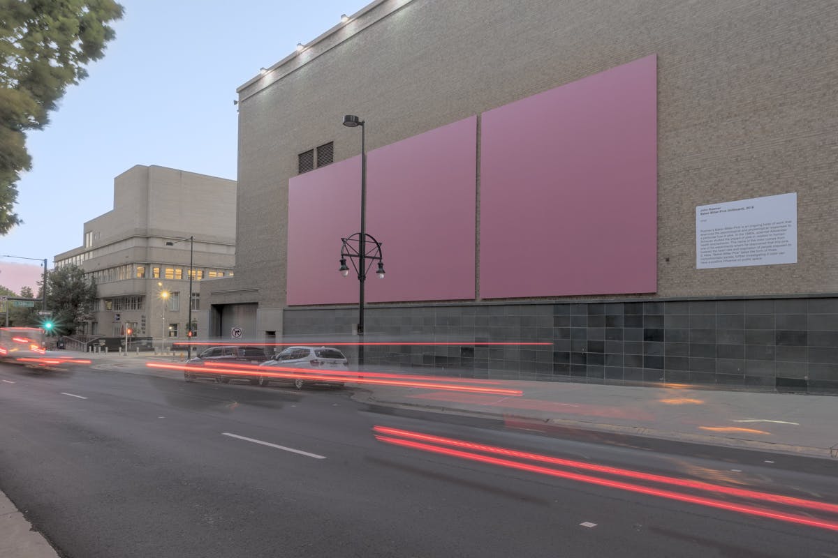
BC: Together, the billboard panels measure 24 feet tall by 72 feet wide. What is the relationship of scale to this artwork?
JR: This work was always meant as an intervention. It was meant to replace advertisements and images that are meant to have influence on their viewers like billboards. The intentions of media presented on billboards are not necessarily positive but Baker-Miller Pink is meant to be positive.
BC: This installation is a part of an ongoing body of work – what do you have planned next for Baker-Miller-Pink?
JR: I think the next piece will be an immersive space that fills with Baker-Miller Pink filtered light. Something more obtrusive than a panel that one can look away from.
BC: Can you describe your studio?
JR: My studio is located in Aurora, Colorado. It's a large garage with an attached office, which I share it with four other artists.
BC: Whose work are you currently following?
JR: Christian Marclay, Sara Vanderbeek, Dardenne Brothers, Brad Troemel, Spencer Finch, Elizabeth Glaessner, Michael Mahalchick (Has a show opening at Lane Meyer Projects in Denver on July 13th)
BC: What work are you most proud of?
JR: I am most proud of my work with Baker-Miller Pink (especially this billboard) because I feel that it clearly and concisely expresses its concept in a way that leads viewers to commit their new knowledge of the color to long term memory.
BC: What do you consider to be your most successful work?
JR: Something newer than the pink stuff are rubbings I made from emblems on cars. I used the letters in logos and model names to spell out the lyrics to "Fast Car" by Tracy Chaplin.